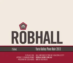
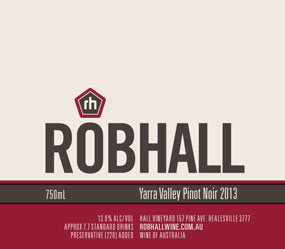
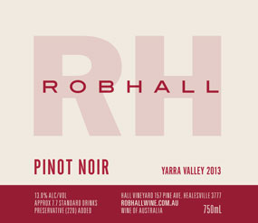
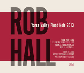
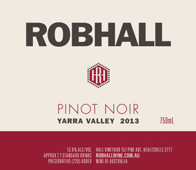
Deciding on a name to slap on the labels was torture. Not exactly water-boarding, but it did cause anxiety. Label design is another thing altogether. Thankfully my designer was part marketeer, part shaman, part psychiatrist, and lays out text like an old-school concreter (solid as rock and smooth as silk). Too much? Anyhow, he managed my anxieties as he would have with many clients before me. Holding my hand throughout, all the while breaking down my stubborn fantasies of a label that has the power to sell vinegar to pinot-philes.
He was given a fairly restrictive brief for the design. A lot of the package was already in my head: no back label, gunmetal grey screwcap (it’s an off the shelf model), no foils or embossing on the label (they cost more and often make labels look cheap). I wanted it to be fairly bold, but not too elaborate.
With not much to work with, the designer sent through 20 separate designs, based around five or so concepts (some shown below). I put these designs to an out-of-focus group selected from my contacts list. The initial response from the first few respondents was predominantly options 11 and 18, neither of which I cared for. I figured I had accidentally, randomly, selected my friends who have no taste. So I sent the 20 options to another group, who surprised me, going the same way. I needed to consult someone who had moved on from Howard-era design, and so I turned to two people who’s taste in all things visual is usually too cool for me to understand: my sister and Marcus Satchell. You can guess what they chose.
At this point I could either follow the masses and choose one of the popular options, or go with my gut. I could at least console myself with the fact that of the two respondents (out of 25) that had chosen my faves, one is a St Kilda socialite, and the other is a prominent Sydney-based sommelier. That’ll have to do.
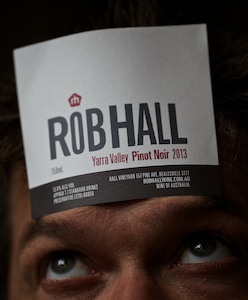
In the end we settled on a combination two designs, with a final tweak from the design office, adding some wonky typesetting to the main font.
The wonky typeset, combined with the off-center logo, was where we settled. I like the logo and it’s position, conjures an image of a clown hat, helmet, religious motif, or a dunces cap. And reminds me of one of my favourite Tom Waits quotes: ‘At some point you have to ask yourself, am I really eccentric, or am I just wearing a funny hat?’. In my case it’s definitely a funny hat, but I’ll wear it with a grin. Some textured paper gives it a warm feel. At the time of printing I was content and hopeful, I’m excited by it now, a better result than I could have imagined at the start.
Sincere thanks to all involved.

